


 Японский кроссворд
 245
 104
 4.3
 10%
 09:29
 x3

 Цветной
 2023-06-20 08:42


Да, белый цвет несколько ухудшает качество кроссворда, особенно, если зрение несколько посажено.

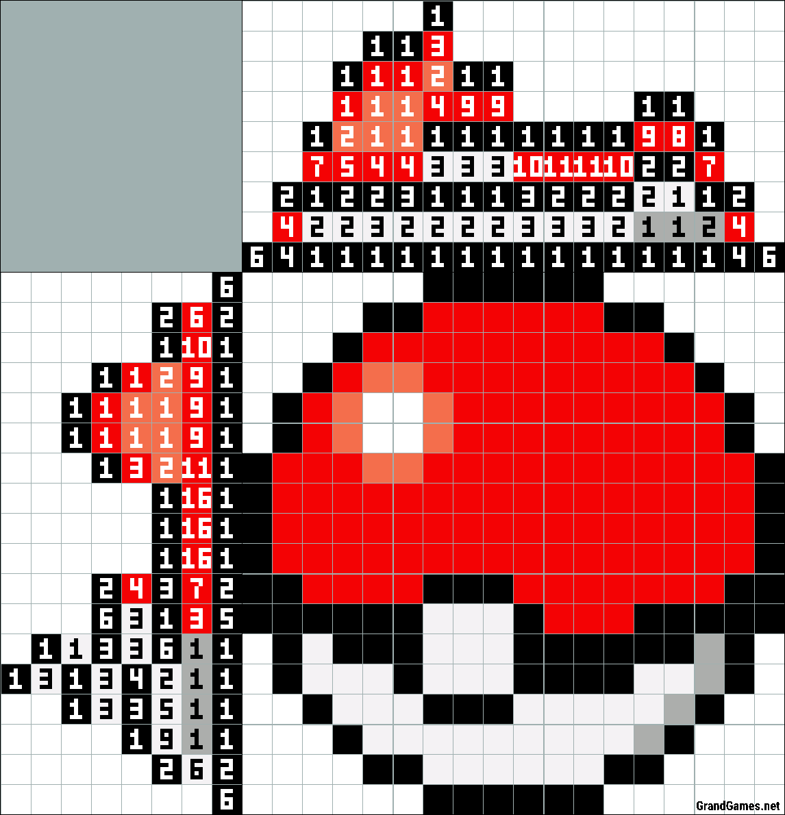
Very good rendition of the ball, but white should not be used as a color. Squares should be left blank instead. Very easy to do though. 

I got good results by changing the background color to #fca. That made the glare spot a lighter shade of red, and made the white stand out.
Without the white, the black outline on the left could be solved in several ways, so the author had to make a choice of which rule to break.
Я получил хорошие результаты, изменяя цвет фона #fca. Это сделало блики место светлый оттенок красного, и сделал белый выделиться.
Без белый, черный контур слева может быть решена несколькими способами, поэтому автору пришлось сделать выбор, какой управлять сломать.


 15%
 3.9
 161
 678
 18x18
 9m.7s.
 x3

 2014-01-25 00:00
 Ответ


